

Frieren Is a Quiet Canvas: Why Kanehito Yamada’s “Boring” Character Is Brilliant Writing
Spoiler Warning: This article references events from the anime Frieren: Beyond Journey’s End, primarily from the first arc. Light references to The Hunger Games, Witch Hat Atelier, and Secrets of the Silent Witch are also included.
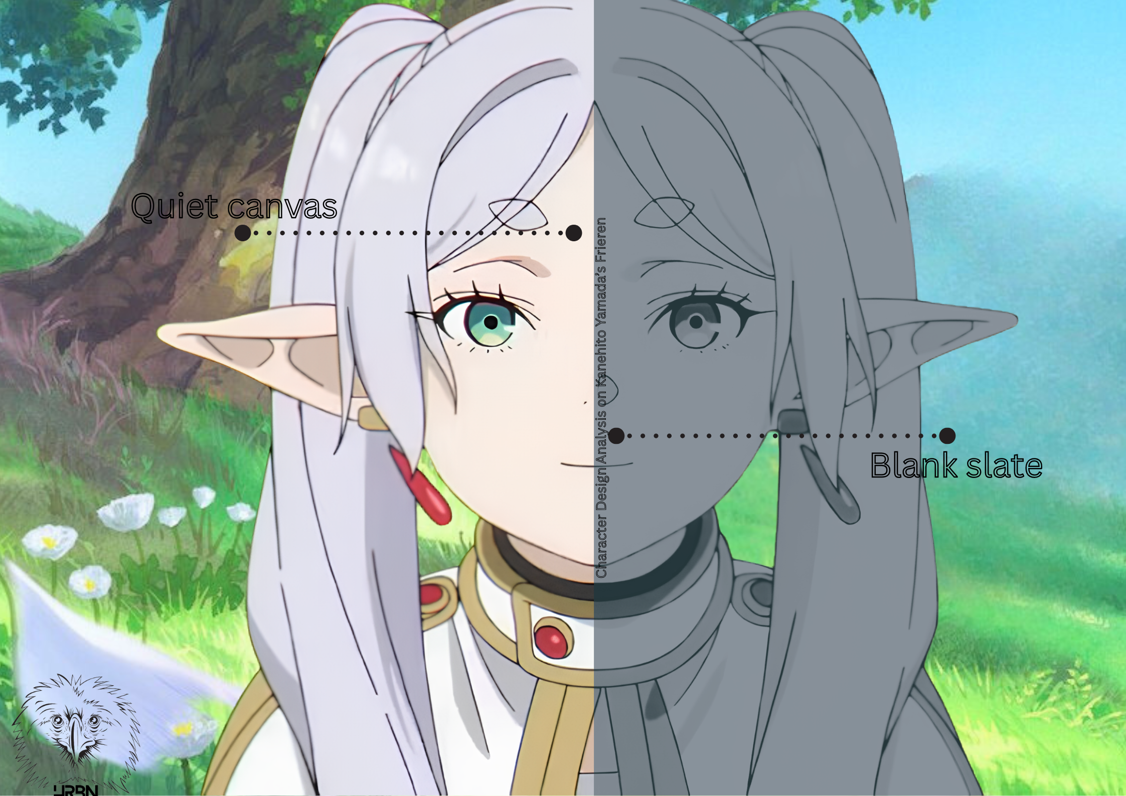
One of the most common criticisms of Frieren: Beyond Journey’s End is that its protagonist is boring. She barely reacts. She speaks in a flat, measured tone. She collects useless spells with the enthusiasm of someone cataloguing receipts. She watches decades pass the way most people watch an afternoon, and when the people she cares about die, she doesn’t scream or collapse—she just stands there, confused by the tears rolling down her own face, unsure of what they mean. Critics have called her emotionally static. Some have called her a blank slate.
And they’re almost right. Writer Kanehito Yamada and illustrator Tsukasa Abe have built a protagonist who is deliberately understated—emotionally restrained, visually composed, rarely the loudest presence in her own story. But she’s not blank. She’s quiet. And that distinction matters enormously, both as a viewing experience and as a writing technique.
The Blank Slate: A Real Technique with a Bad Reputation
The idea that a character can be intentionally simplified to help audiences see themselves in the story is real and well-documented. In his landmark 1993 book Understanding Comics: The Invisible Art, comics theorist Scott McCloud introduced what he called “amplification through simplification.” The principle works like this: the more abstract or simplified a character’s design, the more easily audiences can project themselves onto that character. A highly detailed, photorealistic face is someone specific—it’s that person, with that nose and those wrinkles. But a simplified face—a circle, two dots, a line—could be anyone. McCloud argued that this is why manga and comics so often pair simplified, iconic character designs with richly detailed backgrounds: the character becomes a mask the reader can wear, while the world around them stays vivid and immersive. “The more cartoony a face is,” McCloud wrote, “the more people it could be said to describe.”
This principle has been applied to character writing as well, not just visual design. The “blank slate” protagonist—a character with minimal distinctive personality, designed so that readers can project their own identity into the role—has been a recurring strategy in everything from romance novels to isekai anime to young adult dystopian fiction. The assumption is that the less specific the character, the more readers can see themselves in the story.
The problem is that this approach, taken to its extreme, almost always backfires. As one writing craft analysis puts it, readers tend to sympathize more with distinct, realistic characters, not vague templates. A character with no personality is a void. Truly blank protagonists (the generic isekai hero with no opinions, the featureless YA narrator whose most defining trait is being “ordinary”) invite disengagement, instead of projection. The writing craft blog Mythcreants describes these as “everyman” characters who lack the distinctive personality traits that make great characters, and notes that while they are popular, the technique has a ceiling. While the theoretical basis is sound, the execution needs something more.
Frieren Isn’t Blank. She’s Quiet.
This is where Yamada’s character design does something genuinely clever. Frieren has specific, distinctive traits. She is obsessive about collecting spells—especially useless ones, like a spell that makes flowers bloom or one that turns sweet grapes sour. She is blunt to the point of social obliviousness. She sleeps too much. She is, by her own admission, not a morning person. She has a competitive streak that surfaces unexpectedly during the first-class mage exam. She hoards grimoires the way some people hoard books they’ll never read. These are the traits of a person.
But her emotional register is turned down to almost nothing. Where a typical protagonist would shout, Frieren murmurs. Where another character would cry, Frieren looks away. Where a standard anime hero would monologue about their feelings, Frieren says something like “I see” and moves on. This is the crucial difference between a blank canvas and a quiet one. A quiet canvas has a painting that’s barely visible, and the audience has to lean in close to see it.
As FandomWire noted in their analysis of the anime’s visual approach, Frieren deliberately avoids the exaggerated facial expressions that are standard in anime. There are no comically wide eyes, no theatrical tears, no jaw drops. The character design and the animation both commit to restraint, and this restraint makes the rare moments when Frieren does show emotion hit with devastating force. When she cries at Himmel’s funeral—not understanding why she’s crying, not even fully grasping that she’s grieving—the impact is exponentially greater because we’ve never seen her cry before. The quiet canvas amplifies the emotion exactly the way McCloud’s theory predicts.
How the Surrounding Cast Does the Emotional Labor
Yamada’s design also solves a problem that true blank slates never do: it compensates for the protagonist’s restraint by making the surrounding cast carry the emotional weight. Himmel is earnest and romantic. Fern is quietly fierce, with a temper that flares when she feels her companions are being careless. Stark is openly anxious and emotionally transparent—the character who says what the audience is thinking. Heiter is warm and manipulative in equal measure. These characters feel things loudly and visibly, and because they orbit Frieren, they constantly illuminate her by contrast.
This is a structural decision. Yamada originally envisioned Frieren as the protagonist of a comedy manga about killing demons, according to an interview with editor Katsuma Ogura documented on the Frieren character’s Wikipedia page. After several revisions, Yamada arrived at the current concept: an elf with a lifespan so long that she experiences human life in a fundamentally different register. The comedy version would have needed an expressive Frieren. The version Yamada ultimately wrote demands a restrained one, because the entire emotional engine of the story runs on the gap between what Frieren feels and what she shows—and on the people around her who make that gap visible.
Himmel is the clearest example. He never appears in the present timeline—he’s dead before the story begins—but he functions as Frieren’s emotional translator through flashback. Every time Frieren remembers something Himmel said or did, we learn something about her, not about him. His warmth, reflected against her flatness, reveals the shape of what she lost and didn’t realize she was losing. Yamada has said that when Himmel appears in the story, “the story tightens up”—and that even when it’s sad, “there is a catharsis.” That catharsis works because Frieren’s restraint creates a pressure that only Himmel’s presence can release.
In our previous article on character wounds, we noted that Frieren’s wound is the one she doesn’t recognize—her emotional detachment, a byproduct of her elven lifespan, kept her from truly connecting with the humans she cared about while they were alive. The quiet canvas technique is how that wound manifests on the page and screen. Her restraint is the wound itself, made visible through character design.
The Western Parallel
Western fiction has been experimenting with understated protagonists for a long time, though the technique operates differently in prose than in visual media. F. Scott Fitzgerald’s The Great Gatsby gives us Nick Carraway—a narrator who is deliberately restrained and observational, allowing the louder, more vivid Gatsby and Daisy to dominate the emotional landscape. Nick has opinions and judgments. But his relative quietness functions as a lens that focuses the reader’s attention on everyone else. The technique works because Nick’s restraint makes Gatsby’s excess feel even more dazzling and Daisy’s carelessness even more destructive.
In young adult fiction, Suzanne Collins’s The Hunger Games is often cited in discussions of reader-projection protagonists. Collins writes Katniss Everdeen in first-person present tense—a technique that creates intense immediacy and puts the reader directly inside Katniss’s head. But Katniss herself is not a blank slate. She is specific, stubborn, emotionally guarded, and frequently unkind. What Collins shares with Yamada is a commitment to emotional restraint: Katniss rarely articulates her feelings directly, which forces the reader to infer her inner world from her actions and observations. The reader does emotional work that the protagonist refuses to do for them. Collins’s prose style—short sentences, clipped clauses, present tense—reinforces this: the writing feels restrained in the same way Katniss is, creating a form-mirrors-content effect that is remarkably similar to what Yamada achieves visually.
The thread that connects all of these characters across cultures and centuries is not emptiness but strategic quiet. The technique is about making your protagonists quiet, not hollow, in a way that turns the audience into active participants—reading between the lines, projecting meaning onto small gestures, feeling things the character hasn’t permitted themselves to feel yet.
What Writers Can Take from the Quiet Canvas
If you’re building a protagonist and you’re drawn to restraint—a character who doesn’t emote loudly, who processes things internally, who seems almost detached—the lesson from Frieren is not to leave the canvas blank. It’s to give your character specific, recognizable traits (spell-collecting, oversleeping, bluntness) while keeping their emotional expression deliberately low. The specificity makes them a person. The restraint makes them a mirror.
But the technique only works if you do two additional things. First, surround your quiet protagonist with characters who are emotionally expressive. The contrast is what creates meaning—without it, a quiet protagonist is just a flat one. Second, earn your emotional moments. When Frieren cries, it matters because she has never cried. When she admits she wishes she had gotten to know Himmel better, it matters because she has never admitted vulnerability before. A quiet canvas makes every brushstroke visible. If your character emotes constantly, individual moments blur together. If they almost never emote, each moment becomes an event.
McCloud’s “amplification through simplification” was about visual design, but Yamada proves it applies to emotional design, too. A character whose feelings are simplified—present but barely visible—amplifies the impact of every moment those feelings finally surface.
The Writer Behind the Quiet
Frieren: Beyond Journey’s End is written by Kanehito Yamada and illustrated by Tsukasa Abe. It has been serialized in Shogakukan’s Weekly Shōnen Sunday since April 2020, with 15 tankōbon volumes published as of late 2025. The manga is licensed in English by Viz Media. The anime adaptation, produced by Madhouse, premiered in September 2023 and has earned widespread critical acclaim. Yamada, whose previous serialization Bocchi Hakase to Robot Shōjo no Zetsubouteki Utopia was considered a masterpiece by his editor despite low sales, brings a sensibility to Frieren that prioritizes patience and accumulation over spectacle. The manga has been on indefinite hiatus since late 2025 due to health concerns for both creators. For more on Yamada and Abe’s work, see our earlier piece on the Frieren novel adaptation and its creative team.
We can’t confirm whether Yamada consciously applied McCloud’s theory or the blank-slate principle when designing Frieren. What we can say is that the result operates on the same axis: a character whose emotional restraint creates space for the audience to feel things the character hasn’t fully processed herself. Frieren isn’t boring. She’s quiet in a way that makes everything around her louder. That’s the writing working exactly as intended.